“Visual identity refinement and branded merchandising for two tech-connected companies under the same business umbrella.”

Project Description
This project involved the redesign of the WimacPC logo and the creation of branded promotional and merchandising materials for Woolo, an internet service provider. While both brands operate under the same company, they serve different purposes WimacPC specializes in computer repair services, and Woolo provides internet connectivity.
Context & Visual Approach
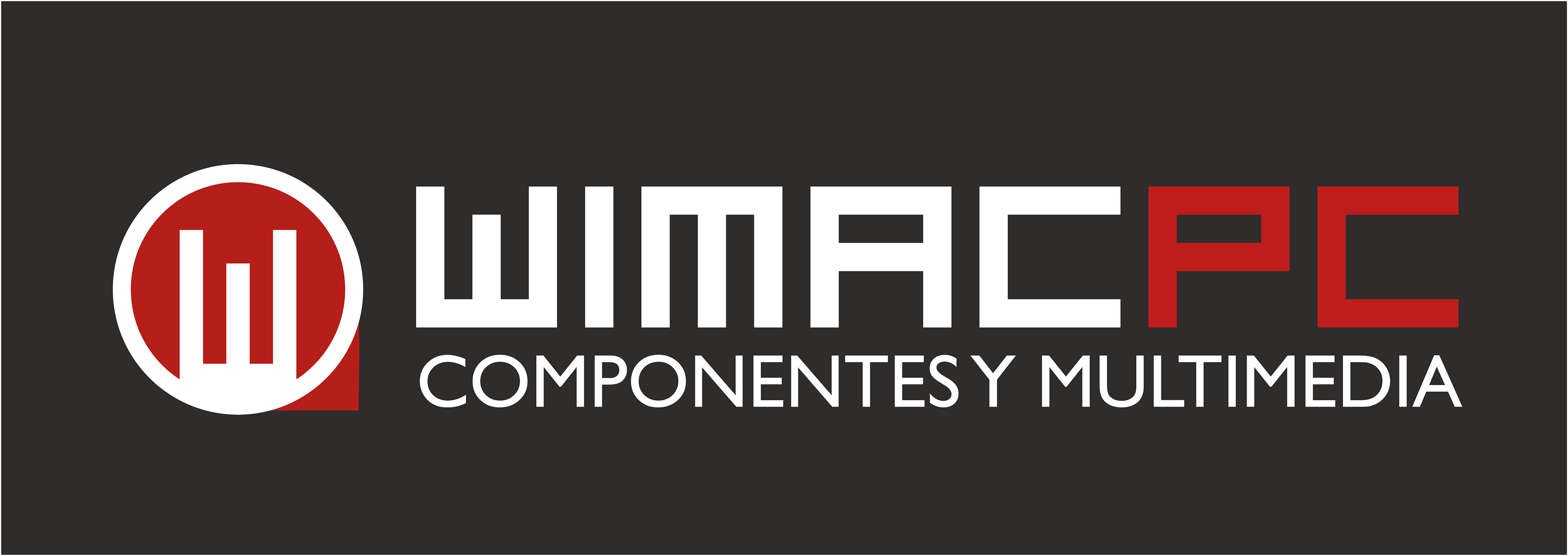
For WimacPC, the logo was modernized to improve clarity, scalability, and brand recognition while retaining the original identity’s essence.
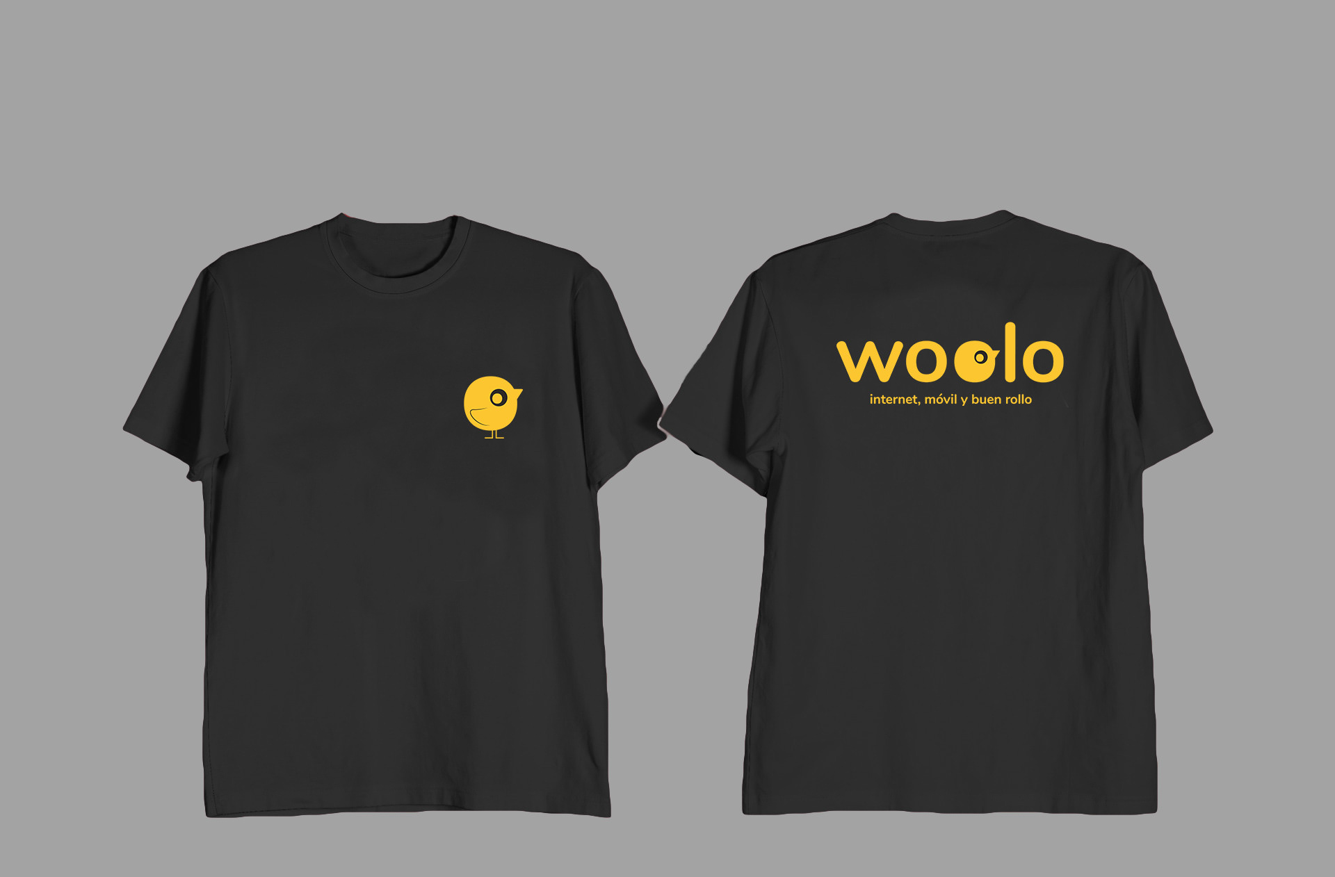
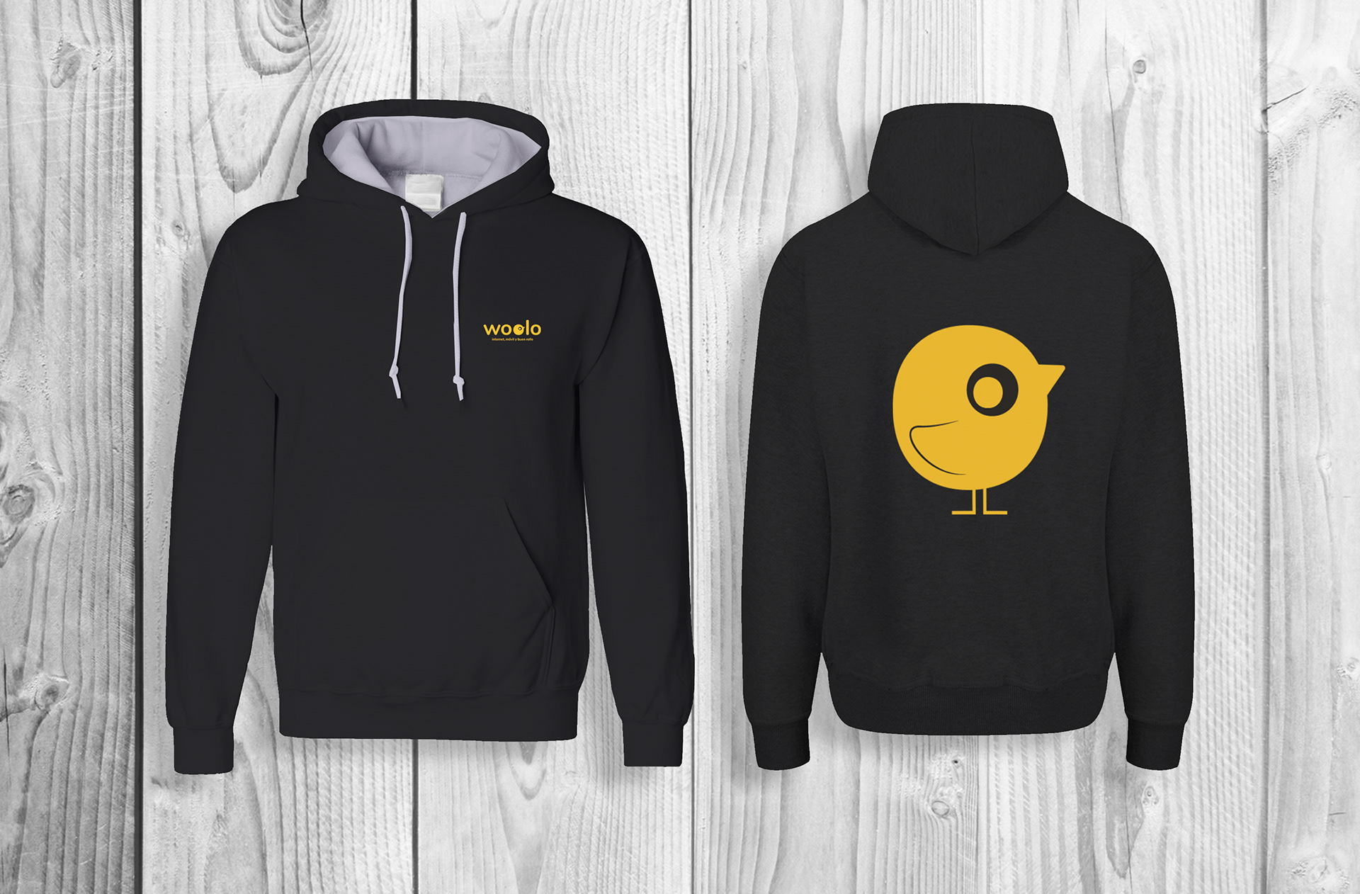
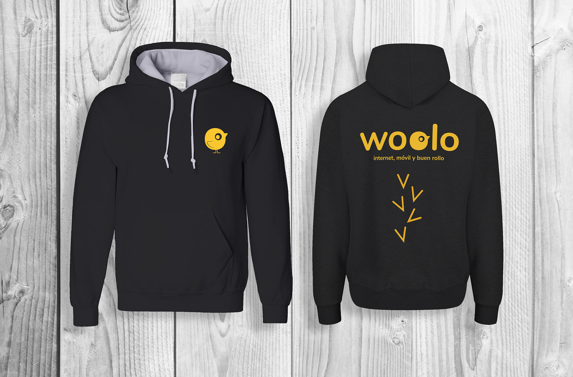
For Woolo, the goal was to extend its existing identity into physical touchpoints, designing scratch cards for client giveaways and bold, modern graphics for employee T-shirts and hoodies. These assets were developed using Woolo’s brand elements, focusing on clean visuals, iconography, and high-impact colors aligned with the brand’s tone.
For Woolo, the goal was to extend its existing identity into physical touchpoints, designing scratch cards for client giveaways and bold, modern graphics for employee T-shirts and hoodies. These assets were developed using Woolo’s brand elements, focusing on clean visuals, iconography, and high-impact colors aligned with the brand’s tone.
Role & Tools
Role: Visual Designer · Brand Extension Designer
Responsibilities: Logo redesign · Merchandising design · Visual adaptation
Tools used: Adobe Illustrator · Photoshop

▮ WimacPC Logotype Restyling
A refined and modernized logo version maintaining brand recognizability and improving application versatility.

Original
Restyling
▮ Woolo Merch Graphics
Designs for employee clothing including T-shirts and hoodies featuring playful and impactful visual elements.

T-shit - Option 1
T-shit - Option 2
Sweatshirts - Option 1

Sweatshirts - Option 2

Sweatshirts - Option 3
Sweatshirts - Option 4
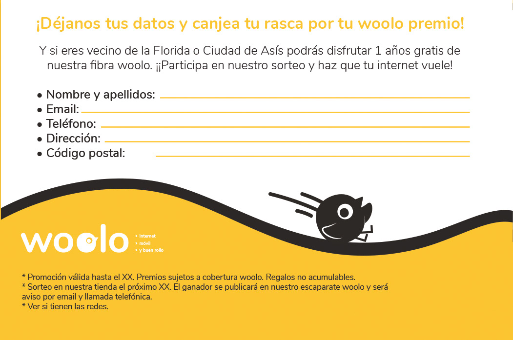
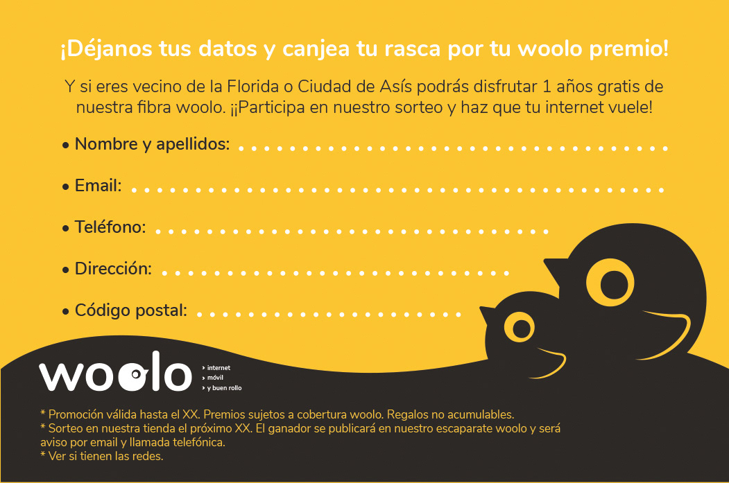
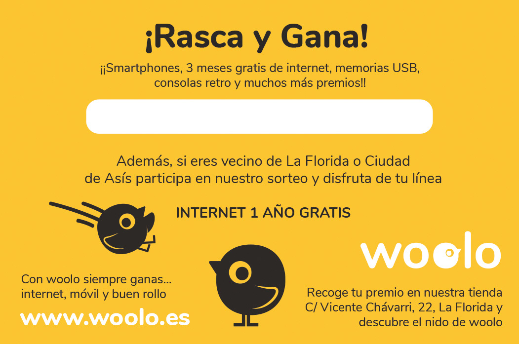
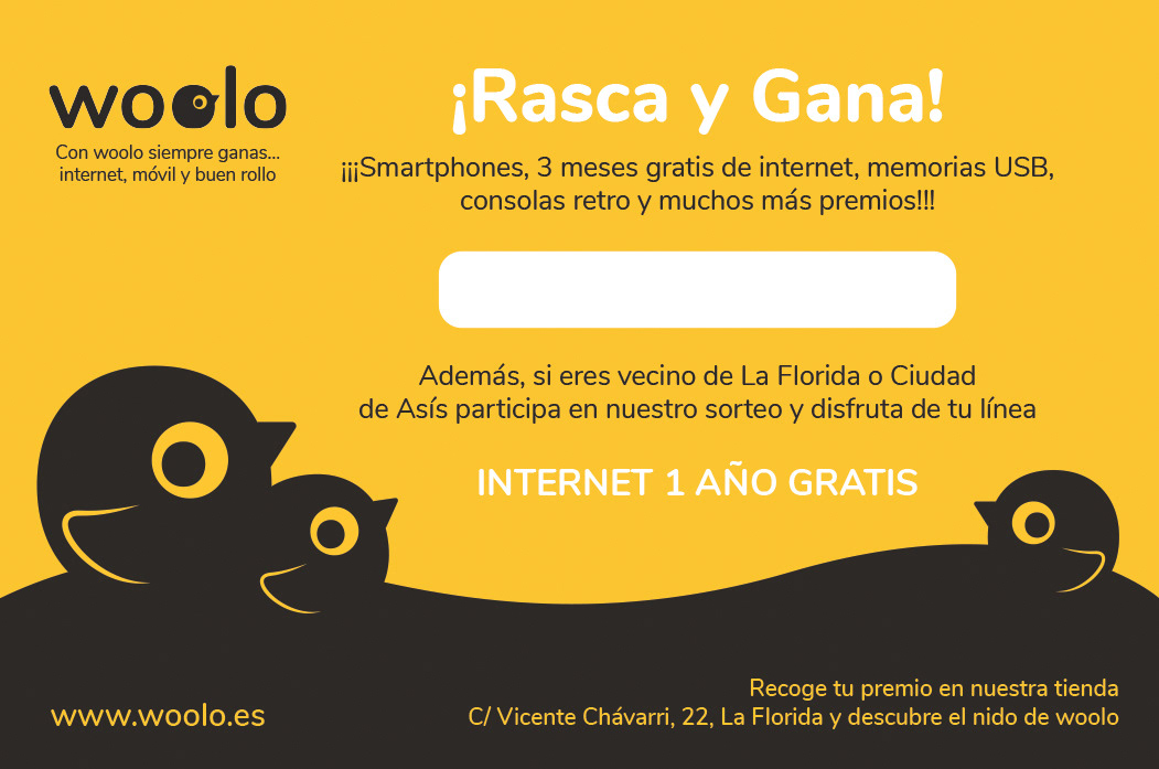
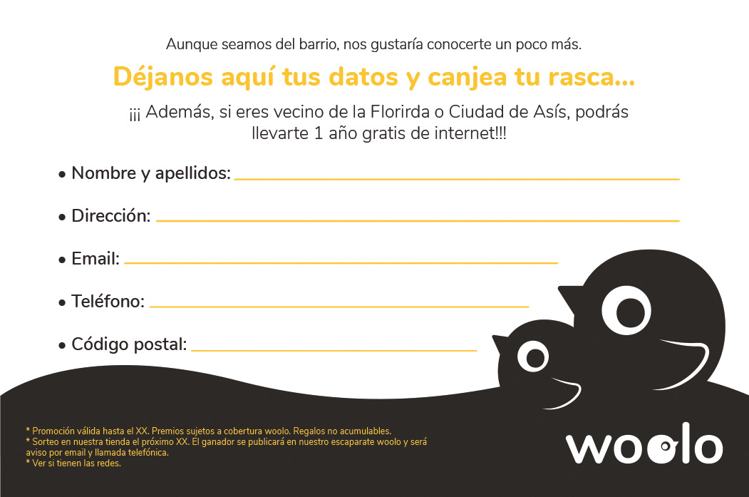
▮ Scratch & Win Cards
Customer giveaway cards using Woolo’s brand language, aimed at boosting client interaction and brand recall.
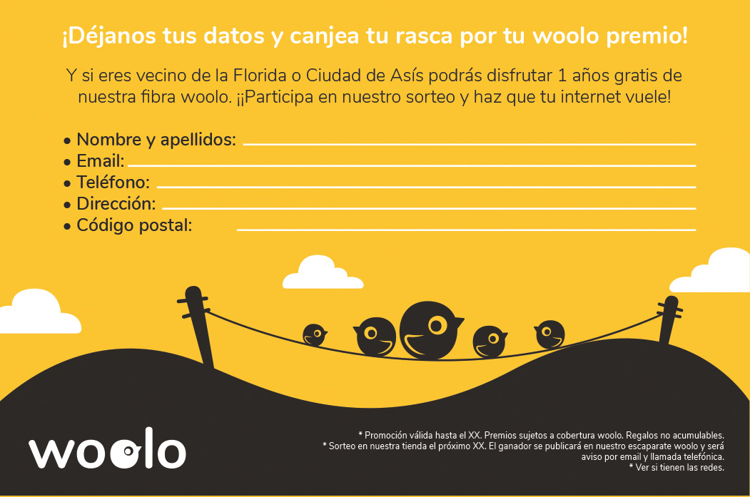
Option 1 - Face B
Option 2 - Face B
Option 3 - Face B
Option 1 - Face A
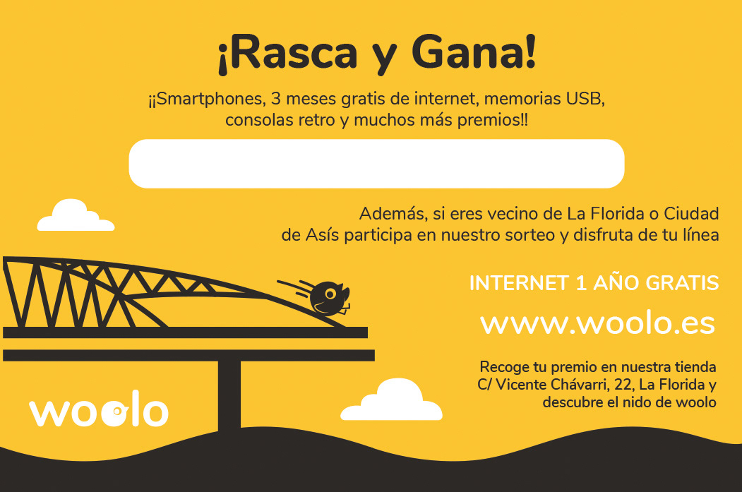
Option 2 - Face A
Option 3 - Face A
Final Face B
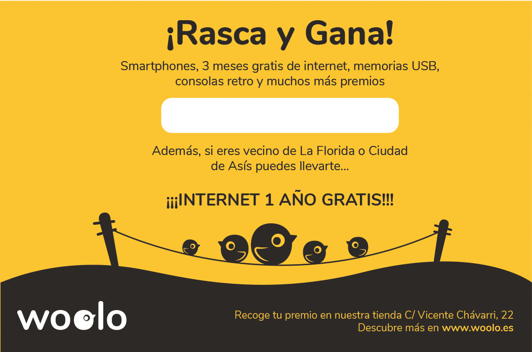
Final Face A

Outcome & Experience
This dual-brand project allowed me to work across visual identity enhancement and branded asset development, applying consistent design thinking to two brands with different goals but shared values. It reinforced my adaptability in both logo design and merchandise development, always aligning with pre-established brand systems.